NAVA Headless Guitars Case Study: Boutique Guitar Website
NAVA build headless guitars for players who want something considered, not mass-produced. We gave the brand a website with the same restraint, showing the instruments with room to breathe and making a custom-build conversation feel like the start of something serious.

The business problem and the opportunity.
The website needed to do more than display instruments. It had to communicate the design philosophy behind the brand, show the guitars with enough polish and restraint, and make custom-build conversations feel more serious and intentional from the first visit.
- Boutique brand website design
- Product showcase structure
- Custom enquiry flow
The build focused on premium visual direction, stronger product showcase structure, and clearer pathways into the range, custom design work, inlays, fretboards, and direct contact with the studio.
The strategy centred on brand atmosphere without losing usability. That meant cleaner section hierarchy, sharper presentation of the headless-guitar range, and content that helps musicians understand the studio's design-led approach without overexplaining it.
The finished site runs on fast custom code and presents NAVA with the restraint the brand is about, so browsing feels considered and a custom-build enquiry feels like a natural next step rather than a leap.
“Rod created an excellent website within a very quick turnaround. No request was impossible to him, and despite both of us working away from each other, the website came exactly as I wanted it to be. If you're looking at having your website created, or just upgrading or even assessing your existing one, Rod will exceed your expectations.”
A closer look at the experience.
The visual direction here was built to support clearer communication, stronger first impressions, and a more deliberate path into the most important content.
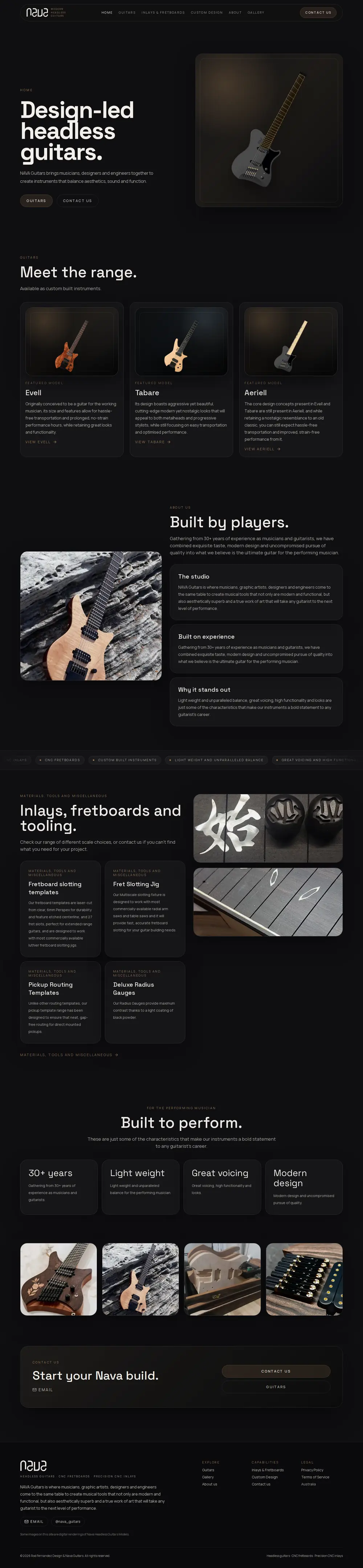
This second screenshot gives a better sense of how the project holds together beyond the hero. It helps show the supporting sections, content rhythm, and the way the layout keeps guiding attention through the page.
This case study links to the live website so you can see how the direction translates beyond the portfolio view.
Open live sitePages connected to this project.
These links connect the project to the relevant service pages, location pages, industry pages, and next-step actions across the site.
New website builds
See the broader service page for custom websites built around positioning, trust, and conversion.
Portfolio hub
Browse the wider portfolio and compare more brand, local-business, and product-style projects.
Request similar work
Start a conversation if you want a more design-led website for a product brand or specialist business.
Questions this project helps answer.
More case studies in this group.

Nords Wharf Trading Post
A lakeside cafe website built to showcase coffee, food, and local atmosphere while making key info like menu, hours, and location easy to find.

Liza’s
A brand-led coffee shop website built to showcase premium coffee, treats, and local character while giving the venue a more memorable online presence.

Chhay By The Lake
A warm, story-led cafe website built to showcase coffee, Banh Mi, and Asian-inspired lunches while making the menu, hours, and lakeside location easy to find.
If your specialist product website still looks more like a placeholder than a serious brand asset, start with the structure and presentation.
A review can help tighten the brand story, improve the product showcase, and create a clearer path toward qualified enquiries.